Our price tracker keeps flagging the same pattern every quarter. Neutrals dominate sales, yet the palettes that earn the most five-star reviews include one or two bolder shades that people actually use. The lesson writes itself. Colour matters as much as convenience.
Retail prices also wander more than you think. The same palette can swing across Boots, Superdrug, Space NK, John Lewis, Cult Beauty, Lookfantastic and Beauty Bay. That makes choice harder, not easier. Pick well and you buy once. Pick badly and it gathers dust.
Start with eye colour. Then layer in finish, depth and formula. You’ll stop guessing and start wearing every pan.
Context: palettes, prices and why undertone wins
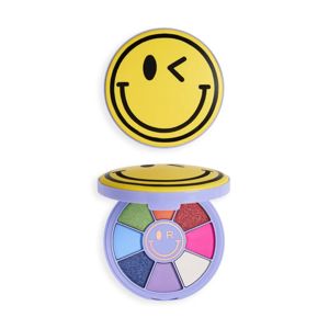
We’ve tracked palette launches since 2010. Formats change with fashion. Nine-pan edits surged around 2016. Twelve pans held steady through 2020. Minis rose again in 2023 for travel and price-conscious shoppers. What never changes? Palettes sell when they offer two things: an everyday anchor and a believable “special”.
There’s another constant. Undertone does more work than shade name. Warm bronzes, cool taupes, true neutrals — these cues decide how a colour sits on skin and next to your iris. If a shade looks dull or harsh, undertone is usually the culprit. Learn it once and you future-proof every purchase.
Finish also counts. Matte builds shape. Satin softens edges. Metallic attracts light. Glitter grabs attention for a night out but often sheds. In damp UK winters, creamy shimmers can crease on oilier lids by lunchtime. They behave better with a proper base and a set. In summer heatwaves, powder formulas hold up longer and transfer less on hooded eyes.
Want a quick win before you shop? Open your current palette and check three things. Do you have a bone or cream matte for cleanup? Do you have two mid-tone mattes in different undertones? Do you have one deep shade with enough depth to line? If not, that next purchase should fill the gap.
{{IMAGE:close-up eyeshadow palette swatches neutral and jewel tones}}Start with the colour wheel: how to pick shades that pop
Colour theory looks technical, but it saves money. Opposite shades on the wheel create contrast. Neighbours create harmony. Both have a place on the face. Strong contrast wakes up the eye. Gentle harmony looks polished and soft.
Blue sits opposite orange. That’s why copper and warm bronze brighten blue eyes fast. Green sits opposite red. Berry, plum and wine shades bring green eyes to life. Brown eyes hold every wavelength, so they handle the widest range. Hazel splits the difference and shifts with what surrounds it.
Test this with one simple move. Swipe a mid-tone matte along the socket in a complementary family. Then tap a related shimmer on the lid. If it looks disjointed, adjust undertone. If it looks flat, punch up texture. The wheel guides the choice; undertone and finish lock the result.
Not sure where to start? Browse our Eye Shadow Palettes and sort by colour family. Then add two options to your GlamGeek wishlist. We’ll ping you when prices shift across retailers.
Brown eyes: rich metals, jewel tones and unexpected blues
Brown eyes handle heat, cool and brights. That range is a gift, but choice fatigue creeps in. Build a small wardrobe. Keep a neutral workhorse. Add a jewel-toned accent stack. Finish with one wild card.
Start with caramel, camel and deep chocolate mattes. These shades sketch structure without muddying. A taupe that runs cool gives shadow without turning orange. A warm brown that leans red adds warmth for autumn skin tones. Pair the two for depth and lift. People underrate a clean matte cream. Use it to erase edges and create a “new lid”.
On top, layer copper, antique gold or bronze. These metals echo natural warmth in brown eyes and read expensive in daylight. Swap to sapphire, teal or midnight navy when you want them to look glassy. Blue metal next to brown irises creates sharp contrast and brings out amber flecks.
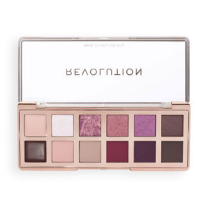
We rate compact edits that balance mattes and metallics. MAC nine-pans still set the brief for depth and blend. Charlotte Tilbury quads cover daily glamour without fuss. On a budget, look at Revolution and KIKO. They offer smart warm neutrals with a pop pan you’ll actually wear. Add potential buys to your GlamGeek wishlist and we’ll track them at Boots, Superdrug and Lookfantastic so you can catch a dip.
Blue eyes: warmth that wakes them up
Blue eyes love heat. Terracotta, rust, apricot and copper hit the opposite of blue on the wheel. They build contrast without neon. A warm mid-tone matte in the crease gives structure. A burnished lid shade does the heavy lifting. Keep at least one cool taupe to tone things down for the office.
Beware flat grey. Silver can look chic under evening lights, but pale frosts can drain blue eyes in daylight. If you want cool shimmer, try pewter or taupe with a brown base. That keeps warmth in the picture while nodding to cooler tastes.
Work with mascara too. A soft brown-black mascara warms the frame and flatters paler lashes. A navy liner in the waterline adds definition without closing the eye. If your lids get oily by lunch, use a thin layer of primer before colour. You’ll cut creasing when the heating kicks in from October to March.
Swatch before you buy when you can. Space NK and department counters often have testers. When shopping online, use GlamGeek’s retailer comparison to see which store has free returns. Save choices to your wishlist and get notified when John Lewis or Cult Beauty runs a promotion.
Green eyes: mauve, plum and burnished bronze
Green eyes and purple shades belong together. Berry, aubergine and soft mauve all sit near red on the wheel. They make green irises sing. Start with a dusty mauve matte to map shape. Add a satin plum to lift the lid. Then press a bronze or antique gold shimmer for warmth and balance.
Soft smoke beats harsh black for day. Try deep eggplant or chocolate as liner shades. These hues define without flattening the green. For quick mornings, sweep a rosy-taupe matte across the lid and crease. Tap a rose-gold shimmer in the centre. Two minutes. You look awake.
Avoid greens that match your iris exactly. They can blur into the eye. Pick khaki, olive or emerald with a brown base instead. Those shades echo the eye without competing. They also work well with autumn knitwear and winter coats in the UK.
Consider brands with strong mauve-plum edits. Morphe does big pans with range if you want options. Charlotte Tilbury packs mauves into chic quads. Budget-friendly lines from Revolution often include a berry row you’ll use. Compare prices across Beauty Bay and Lookfantastic on GlamGeek before you check out.
Hazel eyes: switch-on shades for chameleon irises
Hazel eyes shift. Some days they lean brown, other days green. Build a palette that plays both sides. Keep warm browns and golden olives. Add one plum and one pop purple. Finish with a copper topper.
Use trick-lighting shades to dial up whatever you want to showcase. Gold shimmers pull warmth and amber. Plum satins pull green. An olive matte across the crease connects everything and keeps it chic. If your hazel runs cooler, add a greige matte and a pewter shimmer for balance.
For everyday, run a mid-tone brown through the socket. Pat a soft gold across the lid. Tightline with deep brown. For nights, swap gold for a green-gold shimmer and smoke the outer corner with plum. Hazel irises flip greener at once.
Great hazel-friendly edits appear at different price points. KIKO makes easy trios and quads that suit fast mornings. MAC gives you classic olives and golds in wearable mattes. If you love luxe sparkle, scan Charlotte Tilbury for wet-look metallics. Add contenders to your GlamGeek wishlist. We’ll watch Boots, John Lewis and Space NK for price moves.
Finish matters: mattes, shimmers and glitter in real life
Finish decides texture and wear. Matte sets structure and looks modern. Satin filters light and flatters textured lids. Metallic steals the scene. Glitter sits best on short nights and stays in the box at work.
Age and lid texture shape this call. Drier or more textured lids prefer matte and satin. They blur lines and hold shape. Cream metallics can look lush, but many crease. Use a thin base and set edges with matte shadow. Oily lids do well with thin layers and powder formulas. In damp winters, choose lighter layers and set with a matte bone along the brow.
Hooded eyes need control. Keep shimmers on the mobile lid, close to the lash line. Use mid-tone mattes to push the crease up. Avoid frosts high on the brow bone. They catch light in the wrong spot and drop the lid.
Love sparkle for a party? Use a no-tug glitter adhesive and press, don’t swipe. Do eyes first, face after. That way you can clean fallout without wrecking your base. If you want a similar effect for day, go for micro-sparkle toppers. They give twinkle, not chunks.
{{IMAGE:woman applying eyeshadow with brush warm tones}}Palette shopping checklist: pans, depth and value
Swatch photos can mislead. Use a checklist to keep your head. You want at least one light matte, two mid-tone mattes with different undertones, and one deep shade that reads truly deep. Everything else builds on that foundation.
Check depth. Many palettes lack a true dark. Without it, you can’t line or smoke. Look for espresso, eggplant or near-black. If your skin is deep, expect more. The “dark” in some lines looks mid-tone on rich skin. Seek brands that show swatches on a wide range of skin tones.
Scan for repeats. Some brands sell four coppers that look the same on the eye. If two pans swatch alike, they’ll wear alike. Spend your money on range, not redundancy. Consider pan size too. Do you hit pan on mattes faster? Then a palette with bigger matte pans gives real value.
Think format. Large palettes deliver choice but slow you down at 7am. Smaller edits cut decision time. A nine-pan with smart ratios can outwork a 25-pan with fluff. For everyday, a compact edit from MAC or Charlotte Tilbury works. For weekend artistry, scan the big books from Morphe or budget versions from Revolution. Use GlamGeek to compare prices across Cult Beauty and Beauty Bay. Add to wishlist to catch the dips.
Application tweaks: shape, tools and stay-put tricks
Tools change results. A soft, medium dome brush lays down crease colour without skipping. A flat synthetic brush packs shimmers. A tiny detail brush places depth where you need it. If you only buy three, buy those. Explore our edit of Makeup Brushes & Applicators for shapes that make sense.
Prime if you crease or live in a warm flat. A pea of primer locks colour and evens tone. Tap, don’t smear. Powder lightly with a bone matte if you prefer smooth blending. Oily lids may prefer a slightly tacky base for shimmers. Drier lids may want a set base for mattes. Try both and note which holds through your commute.
Work in thin layers. Build mid-tones before depth. Stamp deep shades close to lashes for a clean lift. Blend edges with your transition colour, not a bare brush. That keeps pigment where you want it. Clean the outer corner with a bit of concealer for a crisp line. If eyes water in wind, tightline with a long-wear pencil and set with matching shadow.
Finish with your favourite mascara. Curl if your lashes point down. One coat for day, two for night. If you want more drama, consider a soft half-strip lash. Apply after liner so you can see the shape.
Blue eyes buying guide: quick picks and palettes that work
For fast mornings, choose a warm-neutral edit with one copper lid shade. A mid-tone camel, a soft taupe, a deep brown and a bright copper will do. That four-pan recipe covers office to dinner.
Build out with a terracotta single if your palette lacks heat. Tap it over the crease for extra contrast. On evenings, swap copper for a rose-gold shimmer. Finish with a brown-black mascara for soft definition. You can find strong options in edits from KIKO, MAC and Revolution.
Before you buy, check GlamGeek’s price comparison. We often see the same edit cost less at Superdrug than at another retailer during weekly promos. Add it to your wishlist for an alert when Boots or Lookfantastic runs a deal.
Green eyes buying guide: plums without the faff
Choose a palette with at least two mauve mattes, one plum satin and a bronze shimmer. That mix hits the wheel and balances warmth. Use the lighter mauve through the crease. Deepen with the darker mauve. Tap bronze on the lid. Line with plum.
Avoid chalky lilacs that go grey. Look for rosy-brown bases in your purples. They blend with neutrals and feel wearable at work. If you love grunge, add an olive matte to smoke the outer corner.
Check ranges from Charlotte Tilbury for refined mauves. Scan Morphe for broader purple rows. Budget lines from Revolution offer solid plum picks too. Save them to your GlamGeek wishlist and watch prices across John Lewis and Cult Beauty.
Brown and hazel buying guide: neutrals that aren’t boring
For brown eyes, the best neutral palettes carry glow without glare. Seek caramel, rose-brown and espresso mattes, with copper and bronze shimmers. That kit builds clean office looks and glam smoke at night. For a twist, add a navy or teal pan to line the lower lash line.
Hazel eyes shine with olives and golds. Shop edits that include a khaki matte, a golden olive shimmer and a deep plum. That trio flips hazel greener without hard lines. Add a soft matte cream for cleanup and a cool greige to mute warmth when you need it.
We see strong edits across price points. MAC wins for dependable mattes. Charlotte Tilbury offers wet-look metallics that flatter evening light. KIKO and Revolution keep costs low without losing trend shades. Use GlamGeek to check who has stock across Space NK, Boots and Beauty Bay.
Prime, set, and survive British weather
Indoor heating dries skin and speeds creasing for many women. Smooth a thin layer of eye primer to even texture. Powder the crease with a matte bone shade before building colour. This gives every blend a head start and keeps edges clean.
On muggy days, go lighter. Swap sticky creams for thin powder layers. Build slowly and set with a touch of translucent powder near the brow. Keep shimmers low on the lid to cut transfer. Carry cotton buds for quick touch-ups if you commute on a packed train.
Humidity can make mascara smudge. Use a tubing formula on the lower lashes. It resists steam and comes off with warm water. Wipe under-eyes after shadow and before concealer. That step keeps the base bright and stops shadow from dulling the skin.
What this means
Choosing an eyeshadow palette by eye colour reduces guesswork and spend. Match undertone, finish and depth to your iris and skin. Then check the price before you commit. Our tracker shows wide swings across UK retailers week to week.
Use GlamGeek to compare across Boots, Superdrug, Space NK, John Lewis, Cult Beauty, Lookfantastic and Beauty Bay. Add your short list to a wishlist and wait for an alert. You’ll end up with palettes you wear to the pan, and you won’t overpay.
If you want a fast route, pick a compact edit that nails the basics. One light matte, two mid-tone mattes in different undertones, one deep liner shade, and your chosen lid shimmer. Choose the colour family that flatters your eye colour. That is a kit you’ll keep.
Finish with good tools and a base that suits your lids. Blend softly. Keep shimmers where they shine. Adjust for cold, damp months and warm snaps. Small tweaks make a big difference to wear time and payoff.
Now tell us. Which palettes actually make your eye colour sing, and which sat unused? Share your wins and near-misses on GlamGeek, add favourites to your wishlist, and we’ll keep an eye on the prices while you plan your next look.