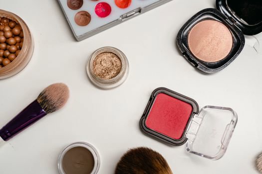
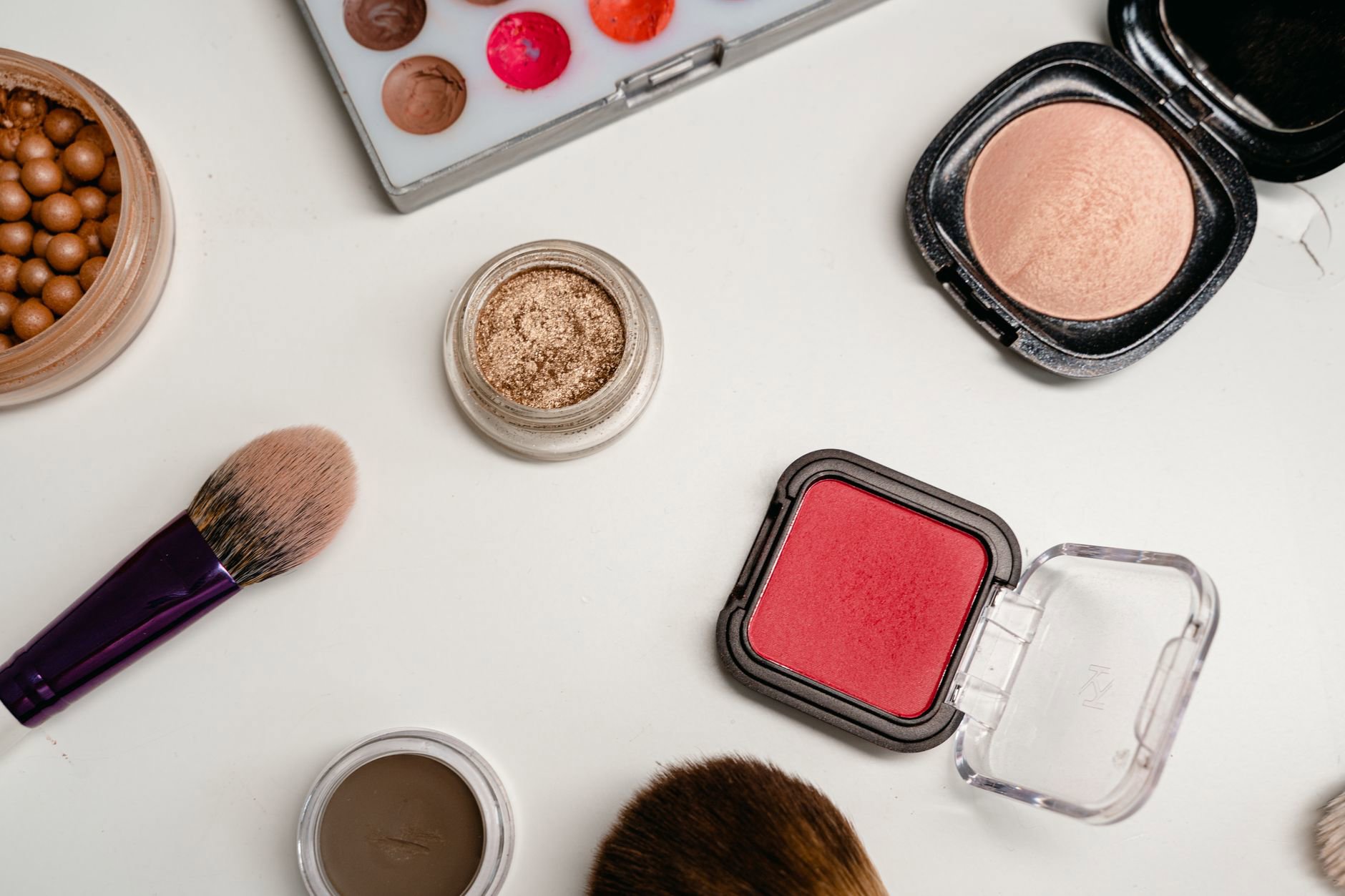
Powder blush adds a flush of colour to mimic natural blood flow in the cheeks, while bronzer adds warmth to mimic sun-kissed depth; they create different optical effects even when shades overlap. Used well, powder blush brightens and lifts the face, and bronzer shapes and warms it—placement, undertone, and finish make the difference.
Many shoppers mix these up because both live in the “cheek products” aisle and both come in powders. But they solve different problems.
We see it in pricing data too: powder blushes sell steadily year-round in Canada, while bronzers spike seasonally. That buying pattern matches real life—blush reads as “healthy” even in February, while bronzer reads as “summer” unless you pick tone and placement carefully.
Here’s the useful shortcut: blush sits higher and more forward on the face; bronzer sits wider and more back. The moment you swap those placements, everything starts to look muddy.
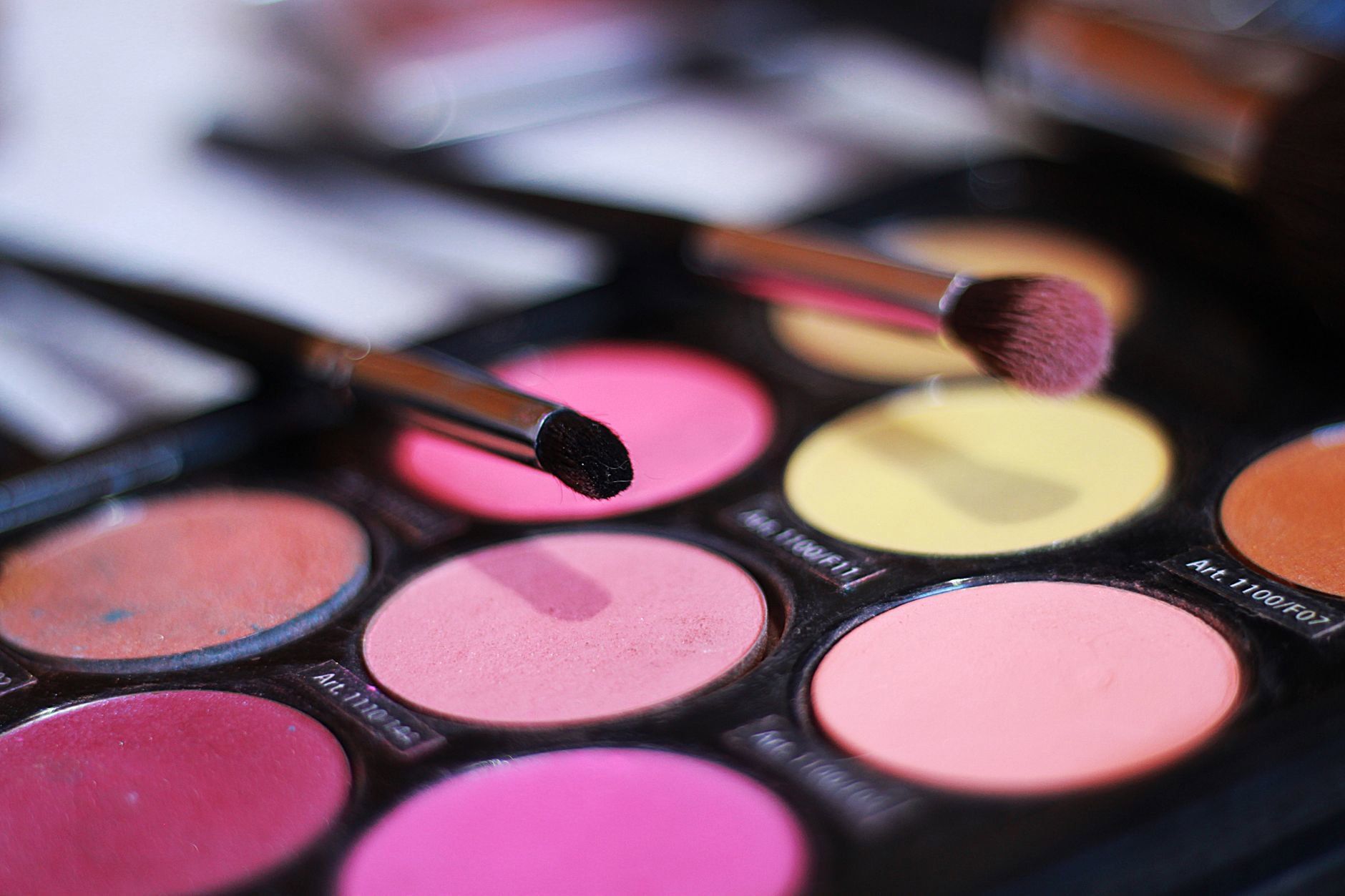
This guide focuses on powder blush (and how to use it alongside bronzer), because powder formulas behave differently than creams in our drier Canadian winters and indoor heating. Expect practical placement, undertone selection, and a few powder blush picks worth putting on your shortlist.
Blush vs bronzer: what each one is supposed to “do”
Powder blush aims to replicate the natural flush that shows up when blood flow increases near the skin’s surface. That’s why the most believable blush shades often sit in families like soft pink, rosy beige, berry, or peach.
Bronzer aims to replicate the warmth and subtle depth from sun exposure. The key word: warmth. When bronzer pulls too orange, too red, or too dark, it stops reading as “sun” and starts reading as a stripe.
Blush changes the perceived shape of your face through colour placement. Bronzer changes it through value (lightness vs darkness) and warmth. That difference matters when you want a lifted look: you usually want blush to pull the face upward, and bronzer to stay soft and diffused so it doesn’t drag the face down.
Finish matters as much as colour. A satin or softly luminous blush tends to look like skin. A very matte blush can look flat on drier skin in winter. A very shimmery blush can emphasise texture. Marketing rarely says that clearly.
If you only buy one cheek powder, we’d still pick blush first for most people. It brings life back after foundation, especially when you also use products from categories like Liquid Foundations and Liquid & Cream Concealers that can mute natural colour.
Undertones, overtones, and why “warm vs cool” isn’t enough
Most “blush vs bronzer” advice stops at warm/cool undertones. That helps, but it misses the bigger issue: overtone (your visible skin depth and surface tone) changes how a powder reads once it blends out.
In practice, two people with “neutral undertones” can need totally different blush families. One might have a rosy overtone and suit muted rose and berry. Another might have a golden overtone and suit peach, apricot, and warm pink.
Here’s a working method we use when comparing shade families across retailer swatches: match blush to the colour you see after light exercise or stepping in from the cold. That’s your believable flush. Bronzer then sits one to two steps deeper than your base skin tone, and should look like a gentle warm shadow—not a tan painted on top.
- Fair + cool/rosy: look for soft pinks and cool roses; avoid strong orange-peach.
- Fair + warm/golden: peachy pink and soft apricot read natural; avoid icy blue-pinks.
- Medium + neutral: dusty rose, warm rose, and muted berry tend to look “skin-like.”
- Tan/deep: richer rose, berry, and brick-rose show up; very pale pink can turn ashy.
Finish ties into undertone too. A luminous blush can add “healthy” to winter skin that looks dull from dryness. A very matte blush can look tidy on oily skin, but may need careful blending around pores.
When shopping, keep Canadian retailer lighting in mind. Sephora Canada’s in-store lighting often runs warm; Shoppers Drug Mart can run cooler and harsher. Always sanity-check swatches in natural light if you can.
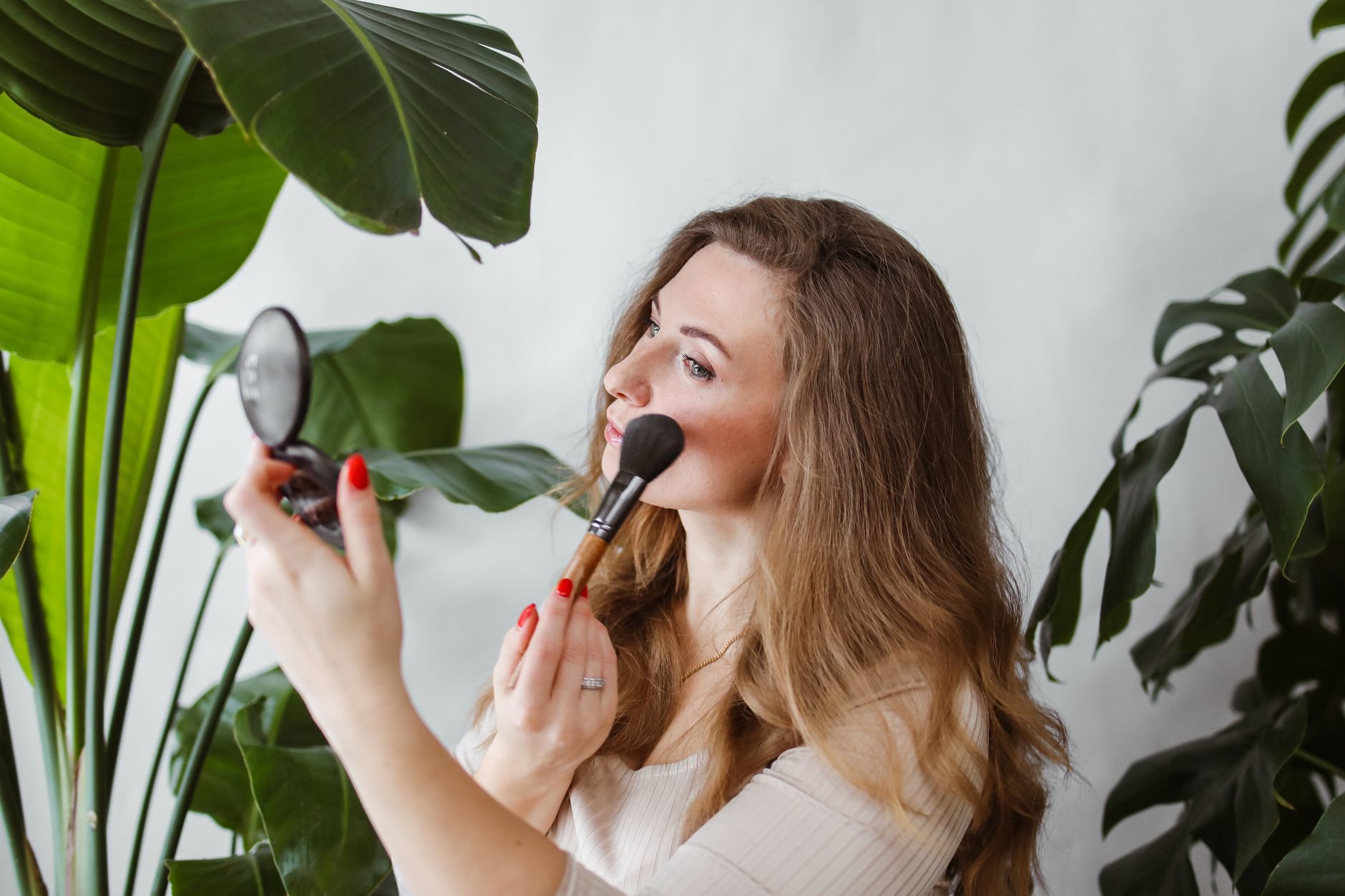
Placement for a natural, lifted look (and where bronzer usually goes wrong)
Lift comes from placing colour where light would naturally hit, then blending upward and outward. Powder blush can do that fast because it sets down and diffuses predictably.
For most face shapes, the most flattering blush placement starts slightly higher than you think: on the outer half of the cheek, centred over the cheekbone, then blended toward the temple. Keep the colour away from the nose if you want lift; bringing blush too close to the nose can make the face look flatter.
Bronzer commonly goes wrong because people use it like contour. Bronzer should look soft and warm, not grey or sharply defined. If you place bronzer too low under the cheekbone and pull it toward the mouth, it can drag everything down.
Try this simple map:
- Powder blush: top of cheekbone → up toward temple; optional light sweep across the bridge of the nose for a “cold air” flush.
- Bronzer: perimeter warmth—hairline, temples, upper cheek area (kept high), and a light touch under the jaw if needed.
- Do not: place bronzer in a straight line from ear to mouth; don’t place blush low on the apples if you want lift.
- Blend direction: always up and back. Downward blending shows.
One sentence rule: blush sits where you want the eye to go; bronzer sits where you want depth to quietly live.
Powder blush formulas: what to look for (and what “baked” really changes)
Powder blush isn’t one texture. Pressed powders can range from dry and matte to silky and luminous. Baked powders often feel smoother and can look more radiant because of how the pigments and binders set in the pan.
When brand descriptions mention a “baked” blush, they often also mention a “softly luminous” or “radiant” effect. If your skin runs dry in winter, that finish can help blush look like skin rather than coloured powder sitting on top.
Here’s what tends to matter most in real routines:
- Pigment load: highly pigmented blushes need a lighter hand; sheer ones may need layering.
- Slip: a smoother powder blends more easily over foundation and sets without grabbing.
- Finish: matte looks polished; satin looks natural; luminous looks fresh but can emphasise texture.
- Longevity: powders generally last well, but very emollient base makeup can shorten wear.
Canadian climate note: indoor heating plus cold air can leave cheeks dehydrated. When that happens, any powder can catch on dry patches. The fix usually isn’t “no powder blush”; it’s better base prep from categories like Day Face Moisturisers, then applying blush in thin layers.
Tools also change results. If you need a softer, airbrushed blush edge, a fluffy brush helps; if you need targeted placement high on the cheekbone, a smaller brush gives control. For readers shopping tools, we keep those links separate under Makeup Brushes & Applicators.
Powder blush picks we’d shortlist (with tracked Canadian prices)
Below are powder blushes that show up consistently across Canadian retailer feeds. We only list prices when we have them in our product set, because guessing prices helps nobody—especially with Canada’s frequent price gaps vs the US.
Clinique Blushing Blush Powder Blush (C$40) — From Clinique. If you want a classic pressed powder blush from a brand that stays widely stocked in Canada, this one sits in the reliable camp. The C$40 price point often lands below many prestige blush launches.
Shiseido InnerGlow Cheek Powder (C$48) — From Shiseido. Our tracker sees it positioned as a premium cheek powder. If you like a refined, modern blush look that doesn’t read chalky, this is a common “one-and-done” option in Canadian carts.
Guerlain Terracotta Blush (C$62) — From Guerlain. This sits at a higher price tier (C$62), so we treat it as a splurge. It often appeals to shoppers who want a warm, sun-touched blush effect rather than a bright pop.
Estée Lauder Pure Color Envy Sculpting Blush (C$61) — From Estée Lauder. Another premium-priced powder blush (C$61). If you prefer a more polished, structured cheek look, “sculpting” blushes often lean that way in marketing and shade design.
MAC Powder Blush (C$36) — From MAC. At C$36, this one tends to look like a better value in prestige makeup. MAC also usually offers a wide shade range in Canada, which matters when you’re trying to match undertone rather than chasing a trend.

Where to buy in Canada depends on brand distribution. Many shoppers start with Sephora Canada for selection, then check Shoppers Drug Mart or The Bay for points promos and sets. Our price tracking often shows short-lived discounts around retailer events, so it pays to compare before checkout.
How to use powder blush with bronzer (without looking muddy)
If you use both, the order and overlap decide the final look.
For a natural finish, apply bronzer first in a light veil around the perimeter and high on the cheek area. Then apply powder blush slightly above and more forward. That layering keeps blush as the “hero” colour and stops bronzer from swallowing it.
When shades clash, the face looks bruised or dirty. It usually happens when the bronzer runs orange and the blush runs cool, or when both sit too close in depth and you lose separation. Choose one warm element and one neutral element, or keep both in the same temperature family.
- If bronzer is warm: pick peach, warm rose, or terracotta-leaning blush.
- If bronzer is neutral: you can wear cooler pinks and berries more easily.
- If you skip bronzer: choose a blush that adds warmth (peach/rose) and place it slightly wider toward the temple.
- If you skip blush: most faces look flatter; bronzer alone rarely replaces a natural flush.
Want lift fast? Keep bronzer diffused and high, then place blush on the upper cheekbone and blend up. Two steps. Done.
If you use setting powder, apply it lightly before blush so the blush blends cleanly. Heavy setting powder can make blush patchy. If you need more wear, build blush in two thin layers instead of one thick one.
Shade choosing in the real world: swatches, oxidation, and Canadian lighting
Powder blush doesn’t “oxidize” the same way some liquid base products can, but it can still shift once it mixes with your base makeup and skin oils. That’s why store swatches on bare skin can mislead.
When possible, test blush over whatever base you actually wear (even a thin layer). Then check it in daylight. Stores in Canada often use bright overhead lighting that flattens colour and makes blush look less intense than it will in the wild.
Use these checks before committing:
- Two-step depth test: the blush should show clearly at one layer, but not look like a stripe.
- Five-minute check: walk around, let it settle, then re-check. Some powders look more intense after they mesh with base products.
- Smile test: if colour pools in lines when you smile, you used too much product or placed it too low.
- Photo test: quick phone camera check. If it reads too strong on camera, it will read strong in person.
- Season swap: many people need a slightly deeper or warmer blush in summer, and a clearer pink/berry in winter.
If you’re shopping online, shade names rarely help. Brand photography also varies by retailer. We suggest cross-checking swatches across at least two Canadian stockists when possible.
One more Canada-specific reality: some US viral shades arrive late or not at all. If a shade never shows up at Sephora Canada or major counters, it can stay a “maybe someday.” In that case, we’d rather pick a readily available powder blush like MAC Powder Blush (C$36) or Clinique Blushing Blush (C$40) than wait months.
Practical tips you can use today (no new products required)
Start lighter than you think. Powder blush builds faster than it removes, especially on set foundation. Tap off the brush, place blush high on the cheekbone, then blend up and back. If you want more, add a second layer only where you first placed it.
Use the “two-finger rule” for lift: keep the strongest blush colour at least two finger-widths away from the nose, then pull it toward the temple. That spacing stops the centre of the face from looking heavy. If you also use bronzer, keep bronzer behind the blush and slightly higher than the hollow of the cheek.
When blush looks too intense, don’t scrub. Press a clean face brush (or the same brush with no added product) over the edges to diffuse. If it still looks strong, lightly dust translucent setting powder over the area and re-tap a tiny amount of blush on top to restore colour without harsh edges.
For winter dryness, prep matters more than buying a new blush. Well-hydrated skin helps powder sit evenly. If you deal with flaking, focus on gentle routine support from skin care and keep cheek powders thin and layered.
Powder Blush vs Bronzer FAQ
Can you use powder blush as bronzer?
You can, but it only looks natural when the blush shade reads as warm and slightly deeper than your skin tone. A rosy or cool pink blush won’t mimic sun warmth and can look bruised when used like bronzer. Keep application very sheer and focus on the perimeter of the face, not the centre.
Do you apply bronzer or powder blush first?
For a natural, lifted look, most people get better results applying bronzer first in a light layer, then placing powder blush slightly higher and more forward. That order keeps blush as the visible “flush” and prevents bronzer from muddying the cheek area. Use thin layers so both blend cleanly.
Where should powder blush go for a lifted effect?
Place powder blush on the upper cheekbone, starting on the outer half of the cheek, then blend upward toward the temple. Keep the strongest colour away from the nose and avoid placing blush low near the smile lines if you want lift. Blending direction matters: up and back looks more lifted.
What blush colour works with cool vs warm undertones?
Cool undertones often suit soft pinks, cool roses, and berries, while warm undertones often suit peach, apricot, and warm rose shades. Neutral undertones can wear both, but overtone (surface tone) still affects how blush reads. When unsure, choose a muted rose and build slowly.
Why does my bronzer make my face look dirty next to blush?
The most common causes include a bronzer that runs too orange or too dark, placement that sits too low, or a temperature clash between warm bronzer and cool blush. Keep bronzer diffused and higher, then place blush above it. Choosing shades in the same warmth family usually fixes the “muddy” effect.