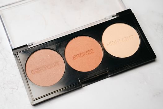
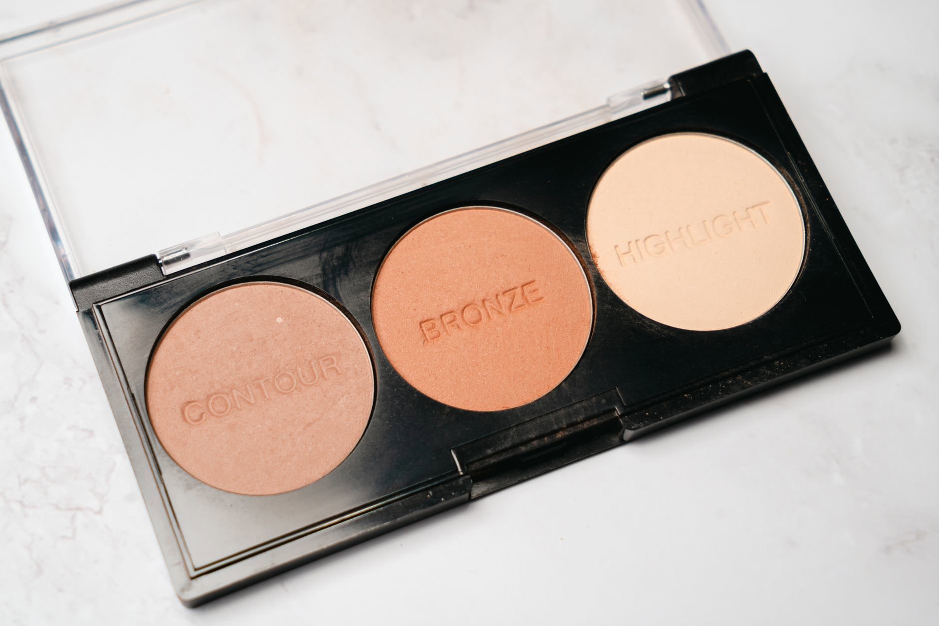
The best powder highlighter shade depends on two things: skin depth (fair to deep) and undertone (cool, warm, neutral, or olive). When those line up, highlighter looks like light hitting skin—not a stripe of shimmer or a grey cast.
Think of powder highlighters as coloured light. Champagne usually reads “neutral light,” gold reads “warm light,” rose reads “cool-pink light,” and bronze reads “deeper warmth.” Match the “light colour” to what your skin naturally reflects and you’ll get that believable glow.
We’ll keep this practical: quick swatch-style guidance, what shade families do to different undertones, and the most common mistakes we see in reviews and returns across Canadian retailers.
Start with depth + undertone (the 30-second check)
Depth is straightforward: fair, light, medium, tan, deep. Undertone takes a bit more pattern-spotting. Cool undertones often pull pink or rosy; warm undertones pull yellow or golden; neutral sits between; olive can look slightly green-grey and often “eats” overly pink or overly yellow tones.
Here’s the fastest way to decide without overthinking: compare your skin to a plain white tissue in daylight. If you look pinker, you likely lean cool. If you look more yellow or golden, you likely lean warm. If you look balanced, you likely lean neutral. If you look a touch muted or greenish next to white, you may lean olive.
Then decide what you want your highlight to do. Powder highlighter can lift (a lighter, brighter shade) or melt (closer to your skin depth, more sheen than “beam”). Most people look best with a shade that sits about 1–2 steps lighter than their skin depth, not five.
- Fair–light: champagne, soft pearl, light rose, pale gold (avoid dark bronzes).
- Medium–tan: classic champagne, peach-gold, warm rose, light bronze (avoid icy white).
- Deep: rich golds, bronze, copper-rose (avoid anything that turns ashy or grey).
- Olive undertones: muted champagne-gold and bronze-gold usually flatter more than pure pink.
Canadian context matters here. Dry winter air can make powder sit on the surface, so a shade that already runs “stark” can look harsher in February than it does in humid summer weather.
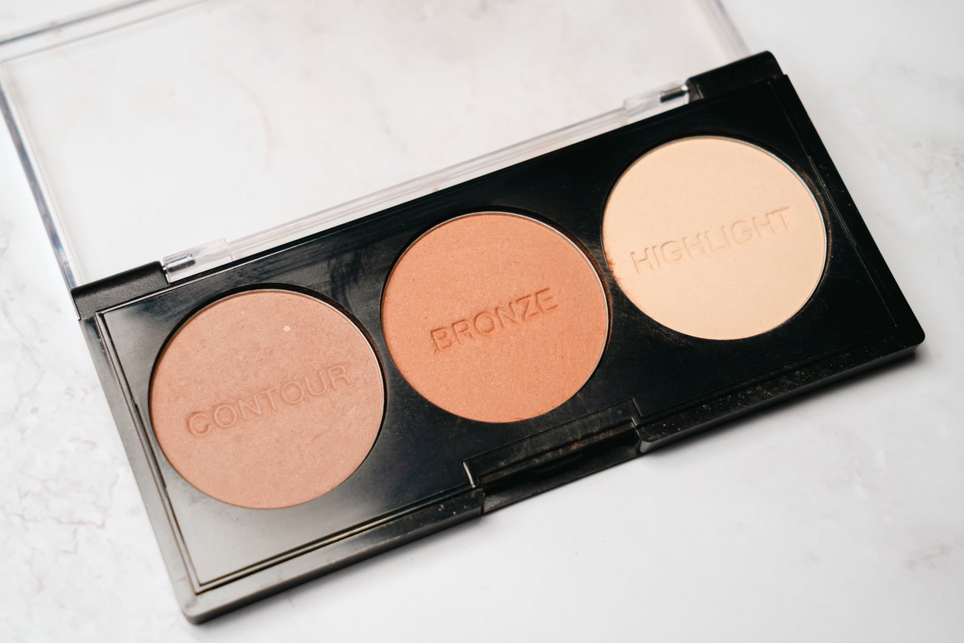
Shade families, decoded: champagne, gold, rose, bronze
Marketing shade names get messy fast, so we stick to four families that show up across brands. Each family has a “best use” and a predictable failure mode.
Champagne sits between pearl and gold. It flatters a wide range because it carries warmth without reading yellow. The risk: on very deep skin, champagne can look like a pale stripe if it’s too light or too silvery.
Gold looks sunlit and amplifies warmth. Warm and neutral undertones often love it. The risk: on cool undertones, strong yellow-gold can look a bit disconnected, like a metallic overlay.
Rose (pink or rosy-peach) can make cheekbones look fresh and “awake,” especially on cool undertones. The risk: on warm or olive skin, a very pink highlight can read as blushy shimmer rather than light.
Bronze reads like deeper warmth and often looks the most natural on tan-to-deep skin because it avoids that pale cast. The risk: on fair skin, bronze can look like a streak of shimmer bronzer—especially if you place it high on the cheekbone.
One more nuance: “icy” highlights often sit inside the champagne family but with more silver. They can look stunning on very fair, very cool tones. They also show texture fast.
Best shade picks by skin depth (with powder highlighter options)
We can’t promise every shade name will appear the same on every monitor, so we’ll frame recommendations by the look to shop for in a powder highlighter. When we mention products, we stick to powder highlighters only and we only name items from our tracked list.
Fair to light skin usually looks best with a soft champagne or light rose. Overly gold tones can read brassy; overly white tones can look stark. If you want a “lit from within” effect, aim for a finely milled powder that builds gradually.
From the powder highlighters we track, these sit in the right lane for fair–light shoppers who want flexible shine:
- Charlotte Tilbury powder highlighter options often run luminous and photo-friendly, which suits a champagne direction.
- Clinique powder highlighter options often suit shoppers who want a smoother, less glittery sheen.
- Sephora Collection powder highlighters tend to offer approachable shade ranges for experimenting with champagne vs soft gold.
Medium skin can wear almost every family, but the most foolproof shades land in champagne-gold and peach-rose. If your undertone leans olive, pick a more muted champagne-gold rather than a bubblegum rose.
Look at powder highlighter lines from MAC and Tarte if you want that “bright but not icy” zone, especially for everyday wear.
Tan to deep skin usually shines (literally) in rich gold and bronze. Here the goal shifts: you want enough depth in the powder so it doesn’t go ashy, and enough reflect so it still reads as highlight, not just shimmer.
For deeper tones, we see shoppers gravitate to richer powders from Guerlain, Estée Lauder, and L'Oréal (when available through Canadian channels) depending on budget and desired intensity.
One sentence that saves time: if a highlighter looks “pale” in the pan, it will look paler on deep skin. Pick a shade that already looks like warm metal—gold, bronze, or copper-rose.
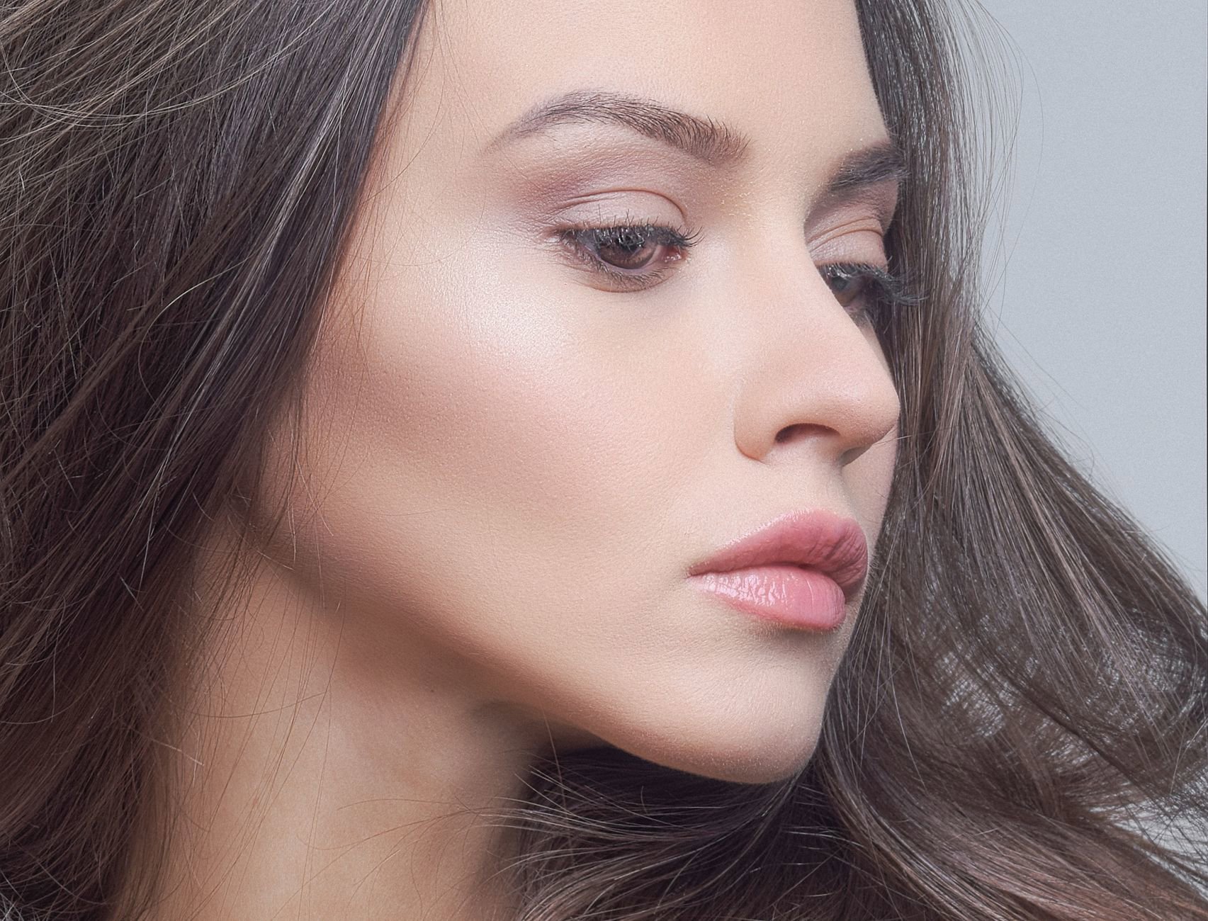
Undertone mapping: what to buy when you’re cool, warm, neutral, or olive
This is where most people go wrong. They buy by skin depth only. Undertone decides whether a highlight looks seamless or sits on top.
Cool undertones: choose pearl-champagne or rose. A soft pink reflect can look natural because it echoes natural flush. If you prefer gold, pick a lighter, less yellow gold—more champagne than true gold.
Warm undertones: choose gold, peach, or bronze depending on depth. Warm skin usually makes champagne look slightly cooler, so a true champagne can still work, but many people prefer a warmer reflect for cohesion.
Neutral undertones: you get the widest range. Champagne works almost always. Then branch: rose if you want freshness, gold if you want warmth, bronze if you want a sunkissed glow.
Olive undertones: aim for muted tones. Too pink can look bruised; too yellow can look brassy. The sweet spot often sits in champagne-gold and bronze-gold. If you want rose, try a peach-rose rather than a cool baby pink.
Brands we often see shoppers cross-shop for undertone variety include KIKO (frequent shade variety), Revolution (budget-friendly experimentation), and Shiseido (refined, skin-like radiance when the formula runs finely milled).
Quick rule: if your foundation pulls orange, avoid strong gold. If your foundation pulls pink, avoid strong rose. Let the highlighter correct, not exaggerate.
Swatch-style cheat sheet: “If this happens, switch to that”
Most shade advice sounds good until you actually apply it. So here’s the troubleshooting version—what the mirror tells you, and what to change next.
- It looks grey or ashy. You went too light or too silvery. Switch from pearl/icy to champagne or gold. Deep skin often needs bronze or rich gold.
- It looks yellow on you. The gold runs too warm. Switch to champagne or rose-champagne. Cool undertones usually prefer less yellow reflect.
- It reads pink like blush shimmer. The rose runs too saturated for your undertone. Switch to champagne or peach-gold. Olive undertones often need muted tones.
- It looks like a stripe. The shade contrast runs too high or the particle size reads glittery. Choose a shade closer to your skin depth or a softer champagne. Then apply less product.
- It disappears after an hour. The shade may match too closely, or your base grips poorly. Try a slightly brighter family (champagne instead of beige-gold) and press it in layers.
- It emphasizes pores. The reflect sits too metallic for your texture. Choose a smoother, more satin-leaning powder highlight rather than a high-sparkle one.
When shoppers want to change the effect without changing the shade family, they often compare a few price tiers. Our Canadian merchant feeds show consistent interest in mid-priced options from MAC and Clarins, then splurge picks from Sisley for a more refined sheen.
Don’t ignore placement. A slightly-too-warm gold can still work if you keep it tight to the high points, rather than sweeping it down the cheek.
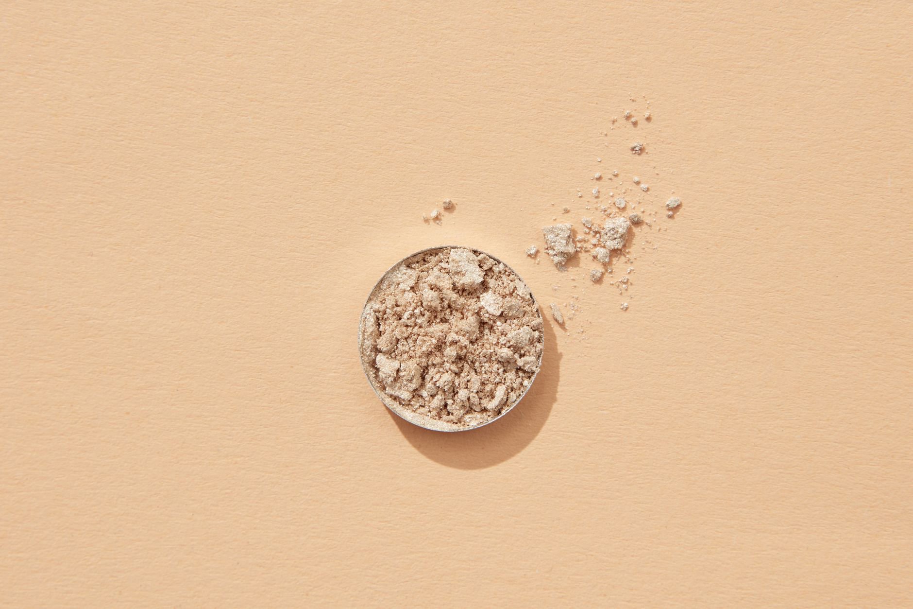
What’s in the powder matters: shimmer size, binders, and why some shades “sit” better
Two champagne highlighters can look completely different. One looks like glossy skin. Another looks like glitter. The difference often comes down to particle size and binders, not the shade name.
Finely milled powders use smaller mica-based shimmer and tighter pressing. They tend to blur more and show texture less. Chunkier shimmer reflects in larger points of light, which reads more metallic and can emphasise pores and fine lines.
Binders matter because they decide how powder grips. Many powder highlighters rely on emollient binders and silicones to help the product adhere and blend. In Canadian winters, that adhesion can save you. Dry air plus indoor heating can make a dry-pressed formula skip, especially on dehydrated cheekbones.
Here’s how to use formula logic when you shop:
- If you want “skin-like”: choose a powder highlighter described or reviewed as finely milled and buildable, often found in prestige lines like Shiseido or Lancôme.
- If you want bold reflect: look for more metallic powders and stronger pigment. Budget brands like Morphe and Revolution often play in this space.
- If you want minimal shimmer look: many shoppers prefer understated options from Clinique or The Body Shop when available in powder highlight formats.
- If you get hardpan easily: avoid over-rubbing the surface and keep the compact closed. Hardpan can make any shade apply patchy.
Ingredient lists vary by SKU, and we won’t guess at specific formulas here. But the mechanism stays consistent: smaller shimmer + better binders = smoother glow, especially on real-world texture.
Canadian shopping notes: shade testing, price-watching, and retailer habits
In Canada, powder highlighter shopping often comes down to three realities: fewer shade options in-store, higher average pricing versus the US, and seasonal skin changes that make one shade look “off” half the year.
We see the widest availability for mainstream and prestige powder highlighters at Sephora Canada, while Shoppers Drug Mart often wins on promotions for mass brands when they stock comparable highlight categories. The Bay and Nordstrom Canada can carry prestige lines, but shade availability varies by location and online inventory.
Our price tracking typically shows that waiting for a promotion matters most on mid-range and prestige powder highlighters. If you already know your shade family (champagne vs gold vs rose vs bronze), you can set a watchlist mindset: buy when the price dips, not when hype spikes.
Two practical tips for shade testing when you can’t swatch in person:
- Look for swatches on multiple skin depths, not just one influencer match.
- Prioritize swatches in natural light. Bathroom lighting turns many champagnes icy and many golds too yellow.
- When undecided between two families, pick the slightly deeper option for winter dryness and texture. It often looks more forgiving.
- If you shop online, choose retailers with clear return policies for colour cosmetics.
One more Canadian-specific reality: if a US-only shade goes viral, Canada sometimes waits. If you need a powder highlighter now, stick to lines that reliably ship through Canadian retailers instead of chasing a single shade name.
Practical shade-and-application tips you can use today
Pick your shade family first. Then make it look good with these small technique changes.
Step-by-step for a natural highlight: start with a tiny amount, place it on the top of the cheekbone, then blend outward. Add a second layer only where light hits. Keep the edges diffused so the shade reads like reflection, not makeup.
Adjust by season: in winter, many people prefer champagne and softer gold because skin looks drier and more muted. In summer, deeper golds and bronzes can look more seamless when your skin tone runs warmer. You don’t need two products, but you may need two placements: tighter and higher in winter, slightly more diffused in summer.
Common mistakes we’d skip: choosing a highlight that’s lighter than your under-eye concealer, using a pink-rose highlight on warm olive skin without testing, and dragging bronze highlight too low on fair cheeks.
If you want more help building the rest of your routine around glow, our broader makeup guides cover related categories like Makeup Brushes & Applicators and base products, but your highlighter shade should stand on its own logic.
Which camp do you fall into—champagne, gold, rose, or bronze—and what’s your undertone (cool, warm, neutral, olive)? We’ll point you to the most forgiving shade family to try first.